Works
Velocity Hub
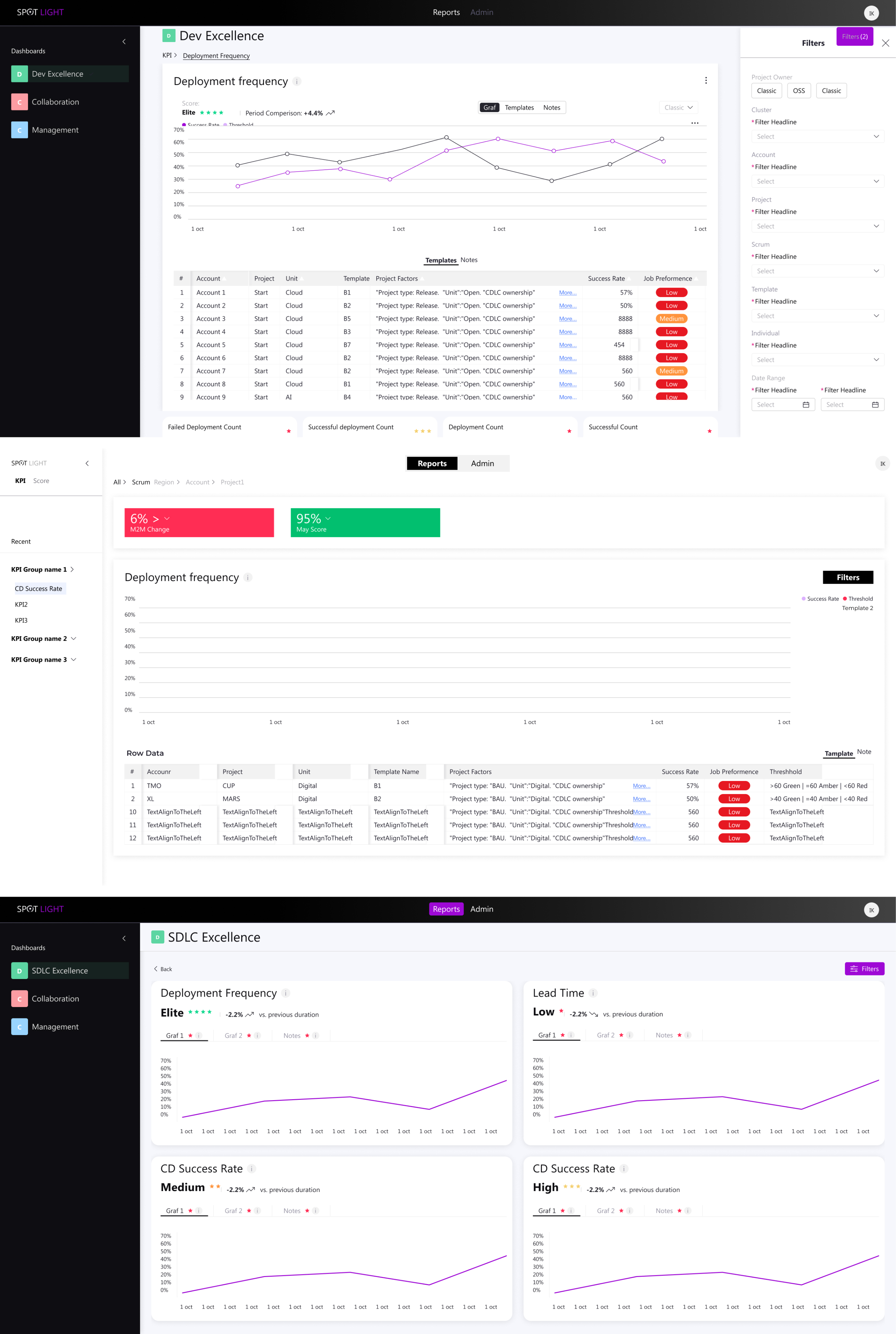
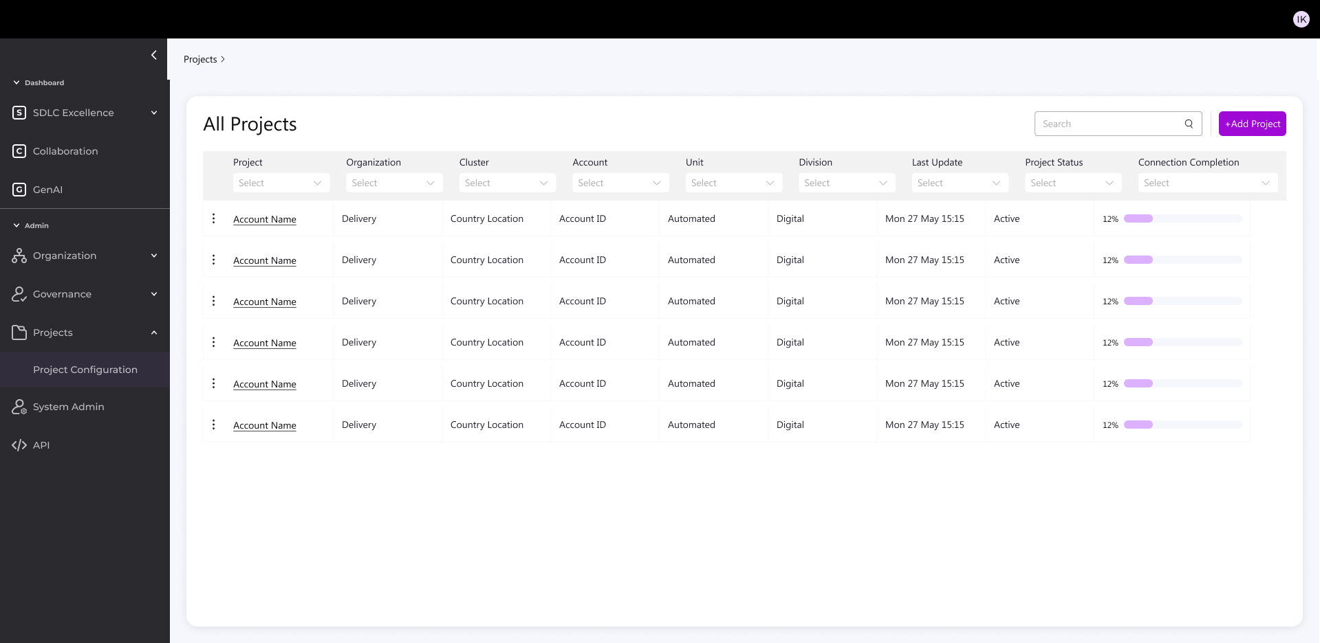
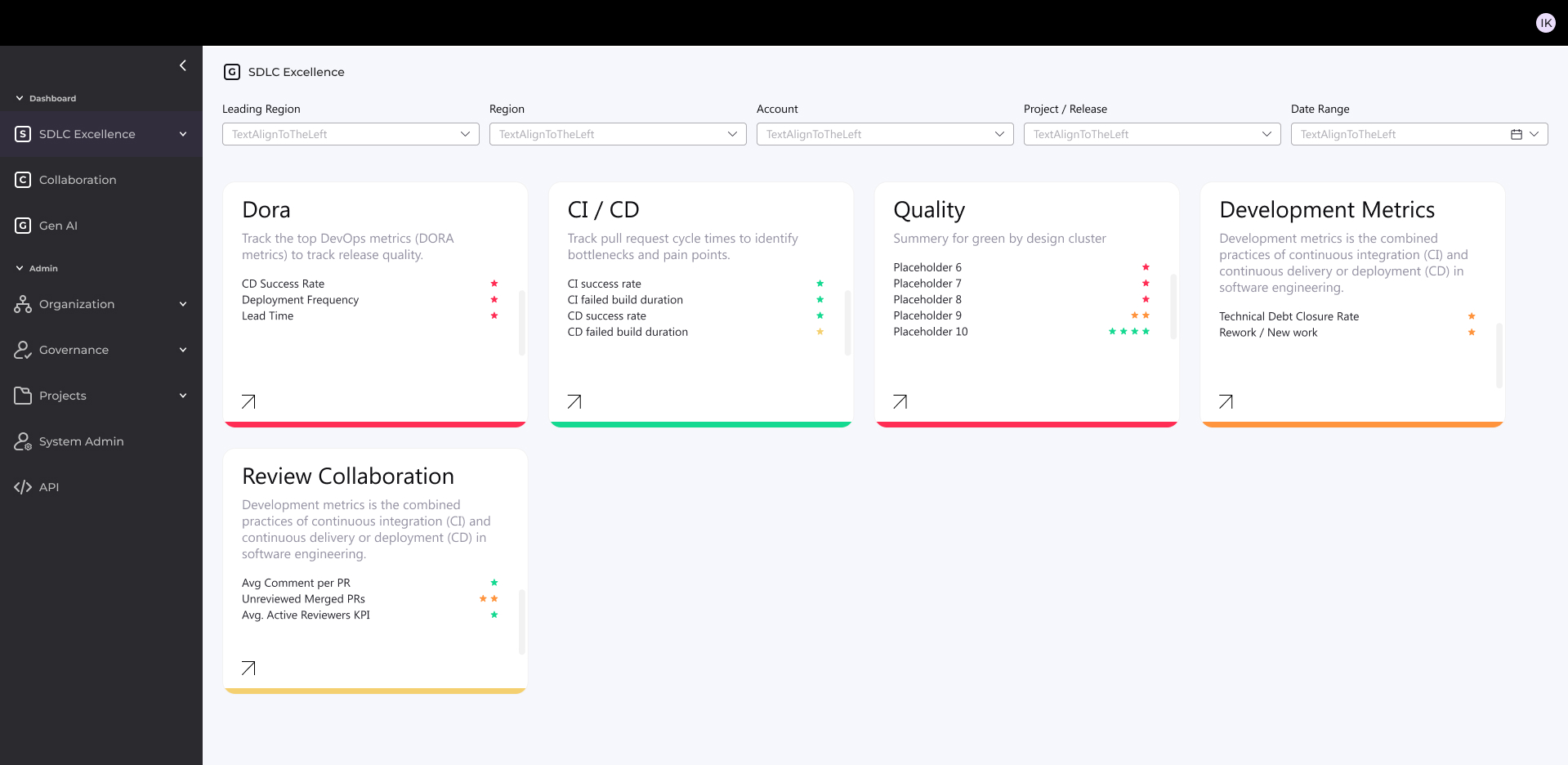
Development Performance Dashboard
Internal configurable dashboard for dev teams and management — tracks performance, detects issues like missed deadlines/defects, and delivers evolving BI insights.
Role: UX/UI Product Designer & Researcher
Led design as the solo designer, collaborating closely with the UX/UI manager, project manager, and front-end/back-end development teams | Amdocs 2024

Organizational Context
The org manages both multi-year projects and smaller CRs under strict deadlines and contractual requirements. Any delivery or quality issue may lead to penalties, reputation damage, and customer loss.

Aim
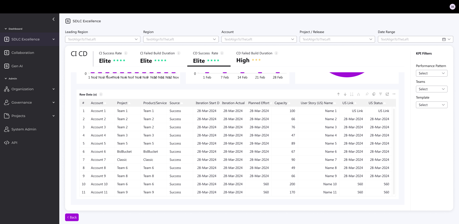
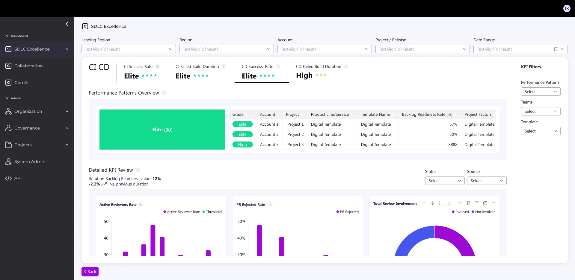
Redesign an internal dashboard for monitoring and evaluating development process performance across the organization.The dashboard detects critical issues in real time, such as: missed deadlines, high defect rates, reduced quality, and security risks.The system has evolved to also provide analytics and business intelligence insights.

What was the challenge?
- Diverse tech landscape – Legacy and Cloud/Digital mixed across accounts
- Different SLAs – unique KPI needs per customer
- Old dashboard was ineffective

Objectives
- Early issue detection: save time, money, and resources
- Maintain customer satisfaction: prevent rework and delays
- Shift Left for all users: actionable business info in real time for both technical and non-technical stakeholders
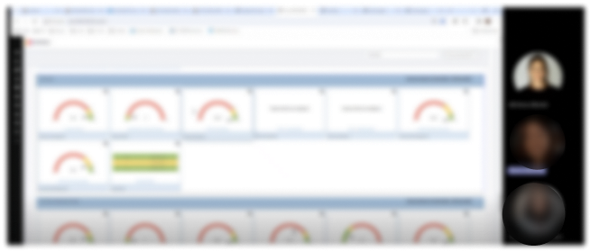
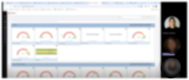
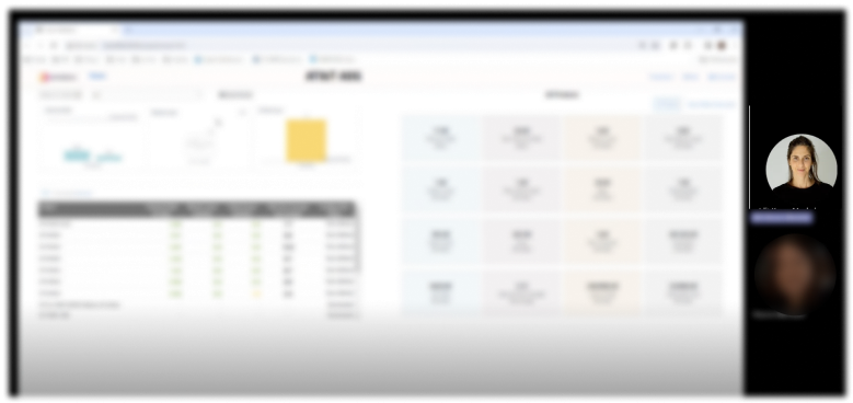
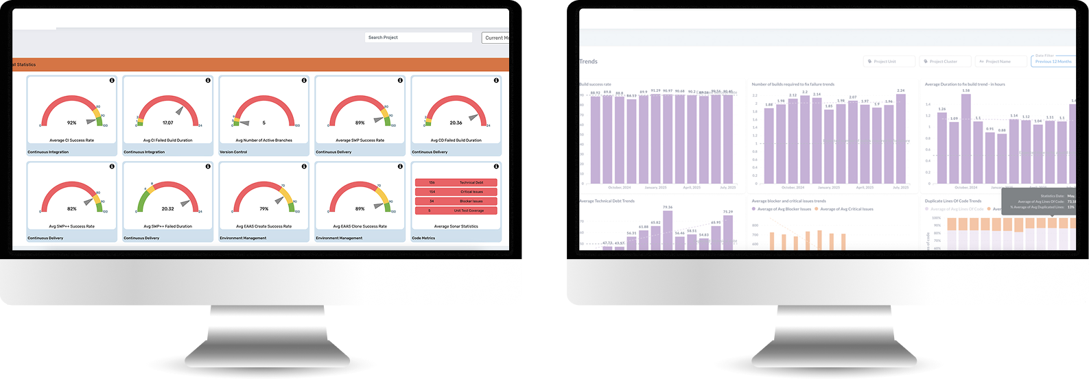
Old System look & feel
It needed to be redesign completely
Who uses the system?

Manager
Tracks organizational performance via KPIs and trends. Makes strategic decisions and receives alerts for target deviations.


Admin
Configures platform, manages users and data sources. Ensures KPI accuracy across teams.


Release Manager
Monitors project performance and trends to guide release planning and resource allocation.


Devops
Monitors CI/CD pipelines and system performance in real-time. Troubleshoots issues and responds to incidents.
Time for research
I used three research methods:

1. User Interviews
Direct conversations with users to understand their goals, workflows, and pain points in real-world contexts.

2. Card Sorting
A research method used to Reveal how users group and label information.

3. Usability Test
Observing users as they complete tasks to identify usability issues and validate design decisions.
1 . User Interviews
I Interviewed experienced legacy-system users to identify daily workflows and pain points.
2. Card Sorting
Organized user interview pain points and needs into clear categories.
Technology challenges
Diverse tech landscape Classic/Digital/Mix
Data analysis
No correlation between the score and the day2day
Presenting irrelevant data
Some KPI are not relevant and are still shown for the user
Data security
The system measure some KPI's partly
Integrating sources
Integrating data from diverse sources and legacy systems causes difficulty
Insights
Missing actionable insights
Missing project customization
Can’t customized project in the system easily
Missing project duplication
User Need to create new project all over again
Messy flow
User Need to manipulate the system for accurate data
Multiple Users need
I 'm getting irrelevant info according to my role
No Standardisations
Missing standardized metrics across all accounts
User friendly interface
The UI must be friendly for non-technical staff to access data
Updated KPI’s
Missing KPIs for modern DevOps, Cloud, AI
Updated platform
The system is not quickly responding to market changes
3. Usability Test
Goal: Validate Users easily find role-relevant KPIs and complete reporting tasks without workarounds.
Quant-Style Usability Results
5 out of 6 users saw KPIs that were not relevant to their role
4 out of 6 users could not explain what action to take based on the data
6 out of 6 users scanned multiple screens to complete a single task
Project & Flow
5 out of 6 users attempted to recreate an existing project instead of duplicating it
4 out of 6 users made manual adjustments to “fix” inaccurate data
Information Architecture & Insights
5 out of 6 users misinterpreted KPI labels
4 out of 6 users expected KPIs to be grouped differently than shown
0 users identified actionable insights without verbal explanation
Role & Relevance
5 out of 6 users received information irrelevant to their role
4 out of 6 users asked to hide or filter metrics they didn’t need
3 out of 6 users assumed the system was “technical-only”
Performance & Trust
4 out of 6 users questioned the accuracy of the data
3 out of 6 users did not trust the score as a decision-making tool
5 out of 6 users wanted clearer explanations or context
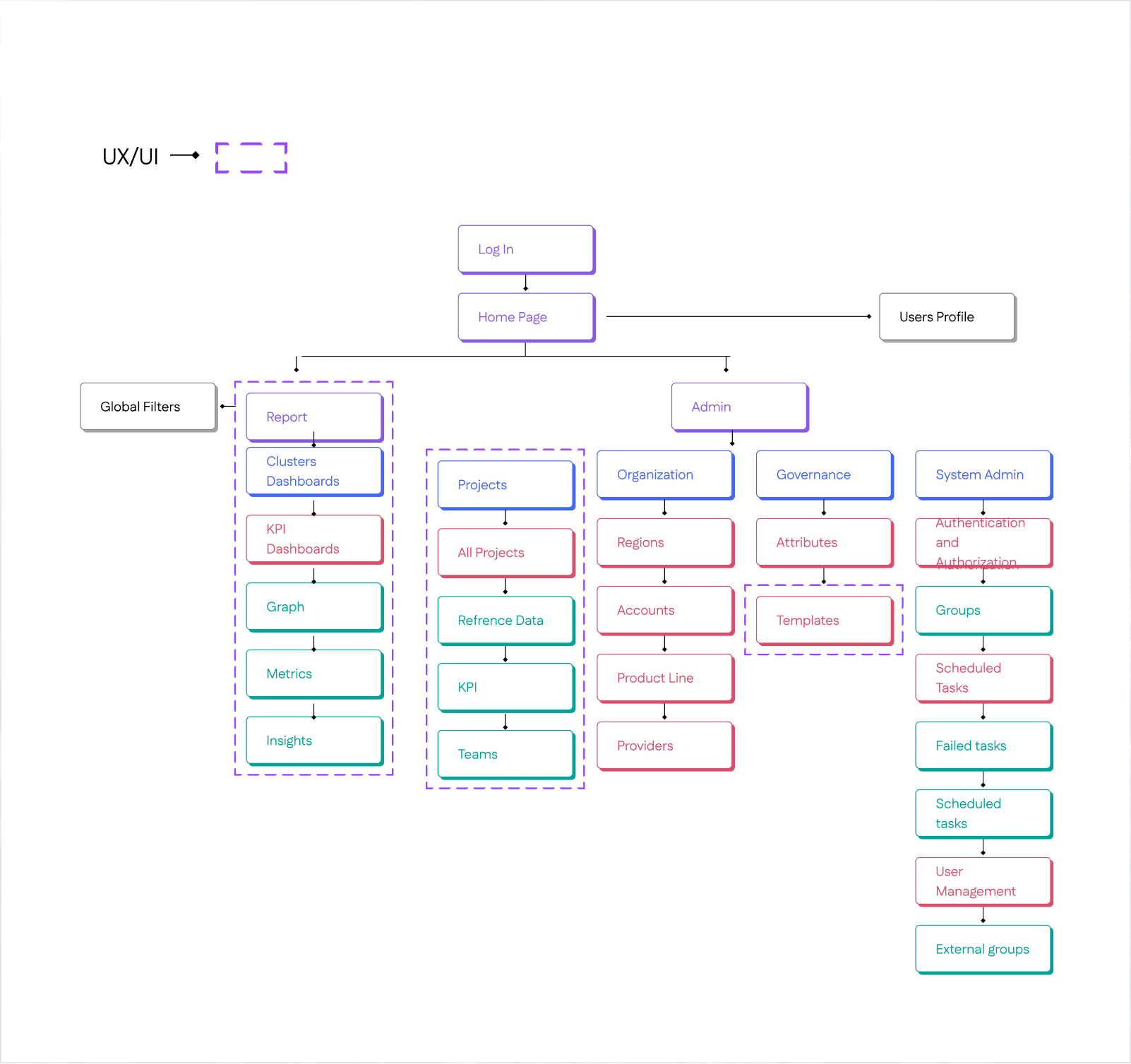
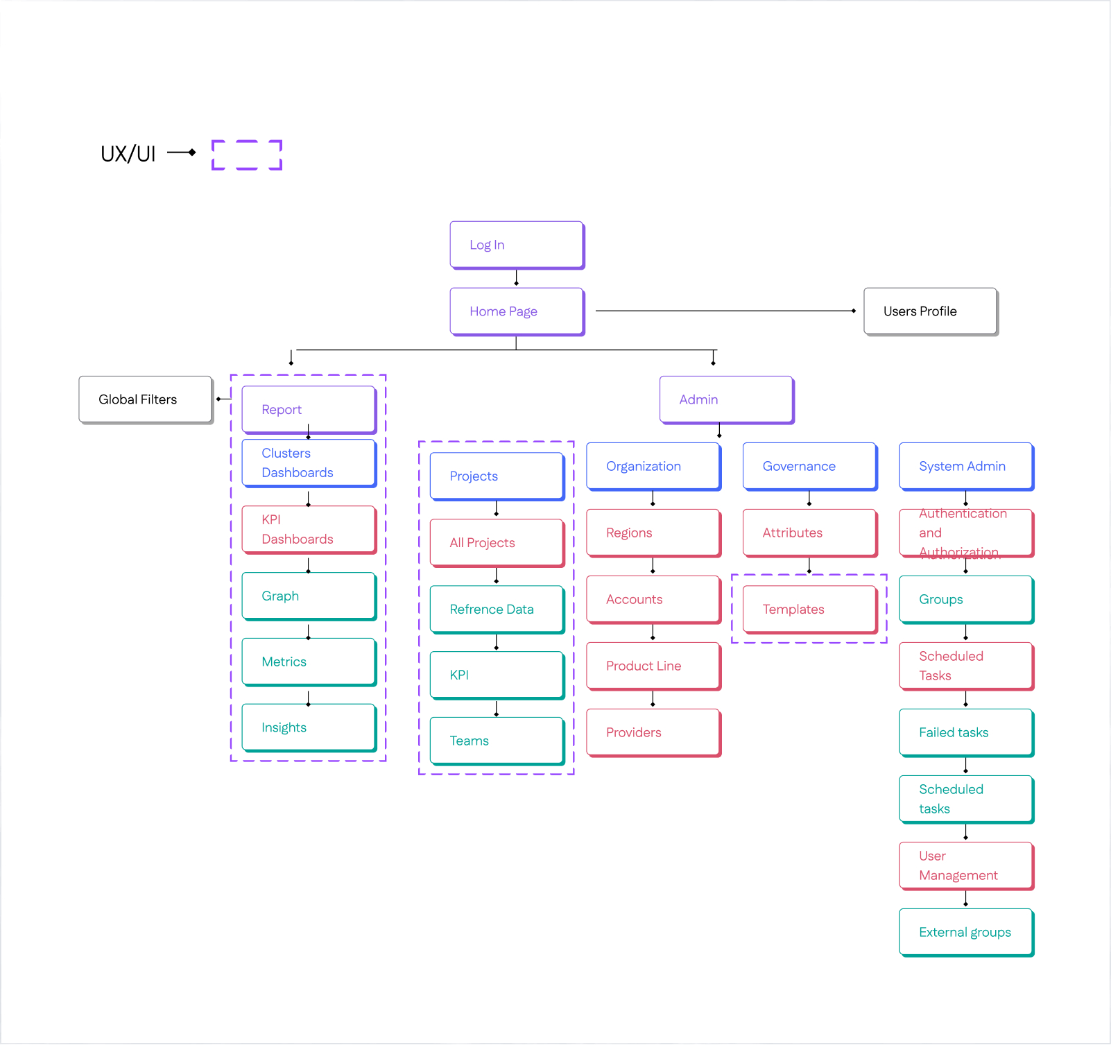
Information Architecture
Before starting design, I created an Information Architecture to organize user flows, clarify component relationships, establish scalable patterns, and align stakeholders early.
Exploring Early Directions
Initial Testing Mockups and Design Alternatives
Early Iterations for the dashboard Evolving from rigid splits to unified flows.
Initially split Reports & Admin (later deprioritized to heater), used vertical filters, and separated template/graph views with varying data viz counts—shifted after requirements ping-pong and Power BI constraints demanded a streamlined, horizontal layout.
Early Iterations For New Project Creation Flow
Started with dense, dependency-heavy forms (top-left mockups): Tried all-in-one screens and split tables, but interdependencies between steps (e.g., notifications → templates) made it overwhelming.
Explored 2-step variants (bottom mockups): Simplified to sequential inputs, but still felt fragmented.
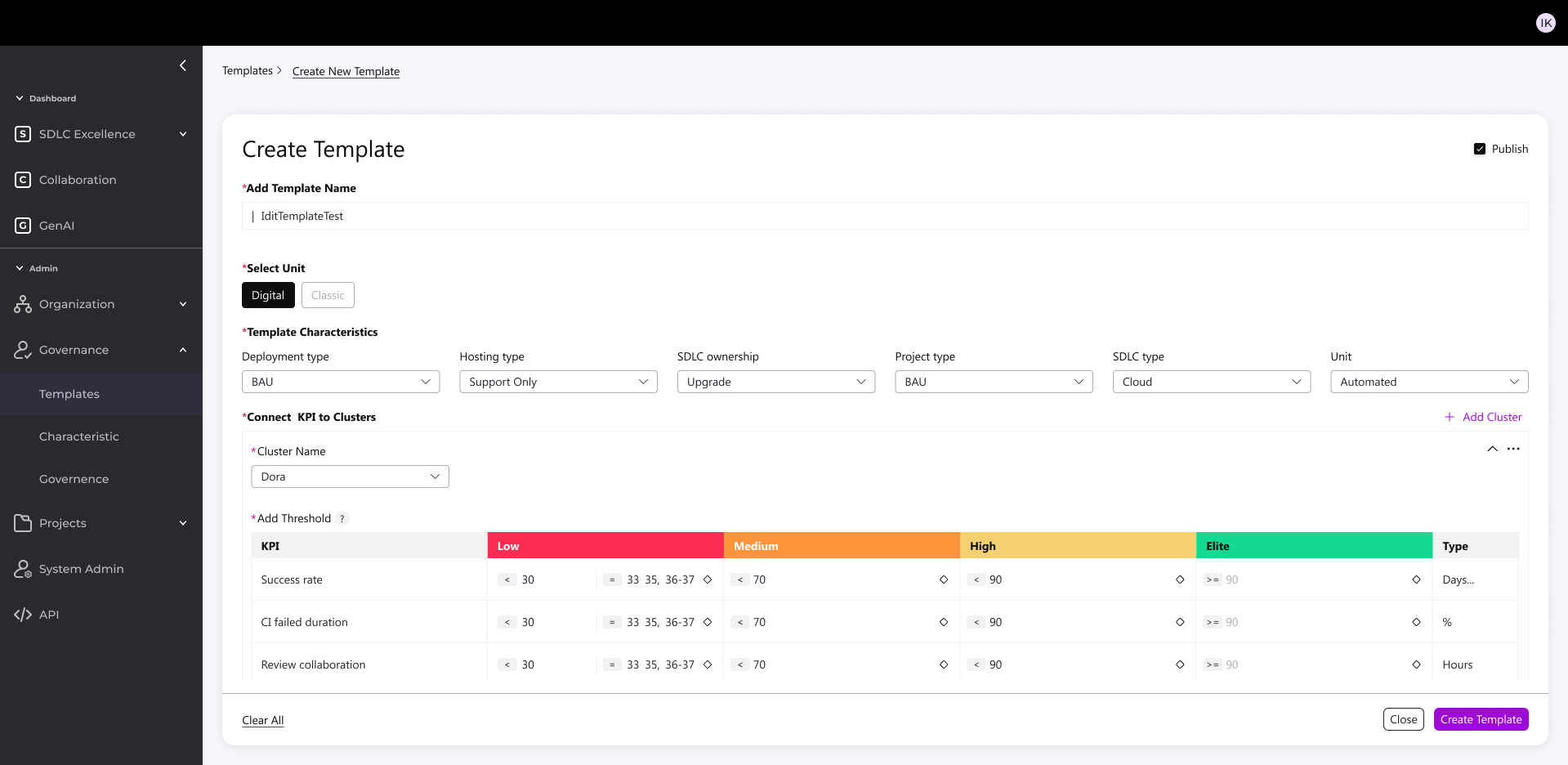
Key Principles of the New System
- KPI alignment with Cloud, AI, and DevOps best practices in the industry
- Standardization of metrics – a unified “measurement bar” across accounts for simplicity and cross-project management
- Full flexibility – enabling accurate measurement per account without sacrificing the unified organizational view
Redesign Foundation: Two Main Components
- Flexible, Smart Backend
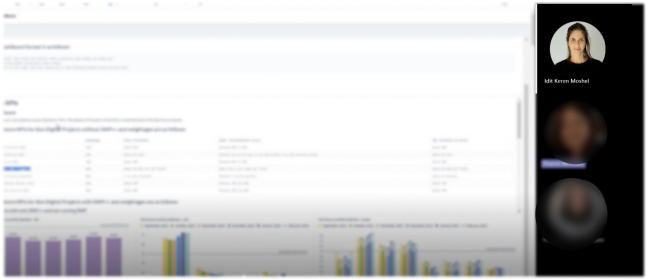
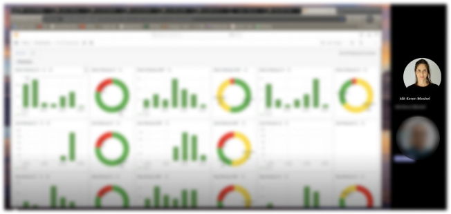
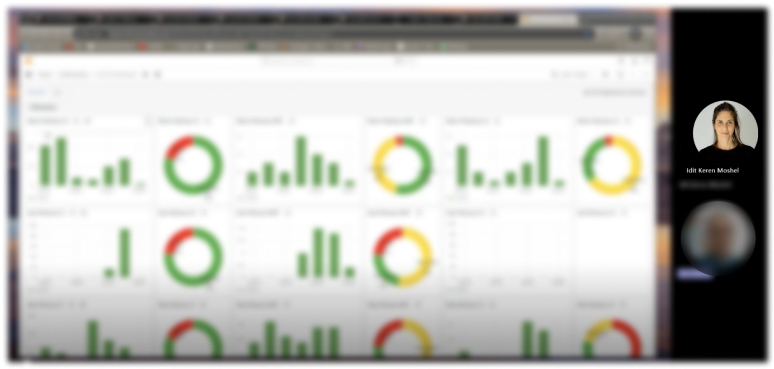
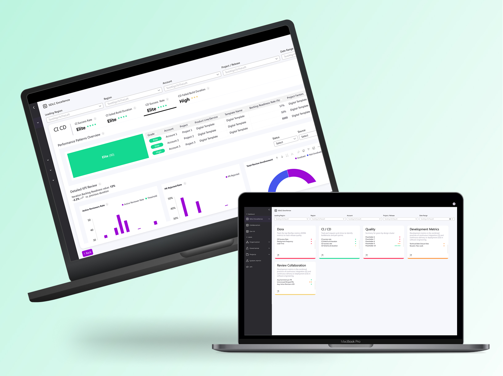
Glimpse from the new design
- Accurate, standardized measurement across all accounts
- Early detection of issues → significant cost savings
- Unified, intuitive user experience for both managers and technical staff
- Sustainable, flexible visualization framework based on joint research with the development team

Backend Design
Built simple admin KPI source connector for accounts/projects from CI/CD platforms
What it does:
- Pulls in real metrics from CI/CD platforms (Jenkins, GitHub, Bitbucket)
- Grabs task tracking data (Jira tickets, sprints, velocity)
- All configurable per account + per project
How I built it:
- React-based config screens
- 5 clean integrations ready to go
- One admin dashboard to manage everything
Result: No more manual CSV uploads or custom scripts—admins just click, connect, and see live KPIs across their projects.
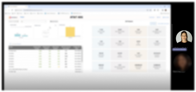
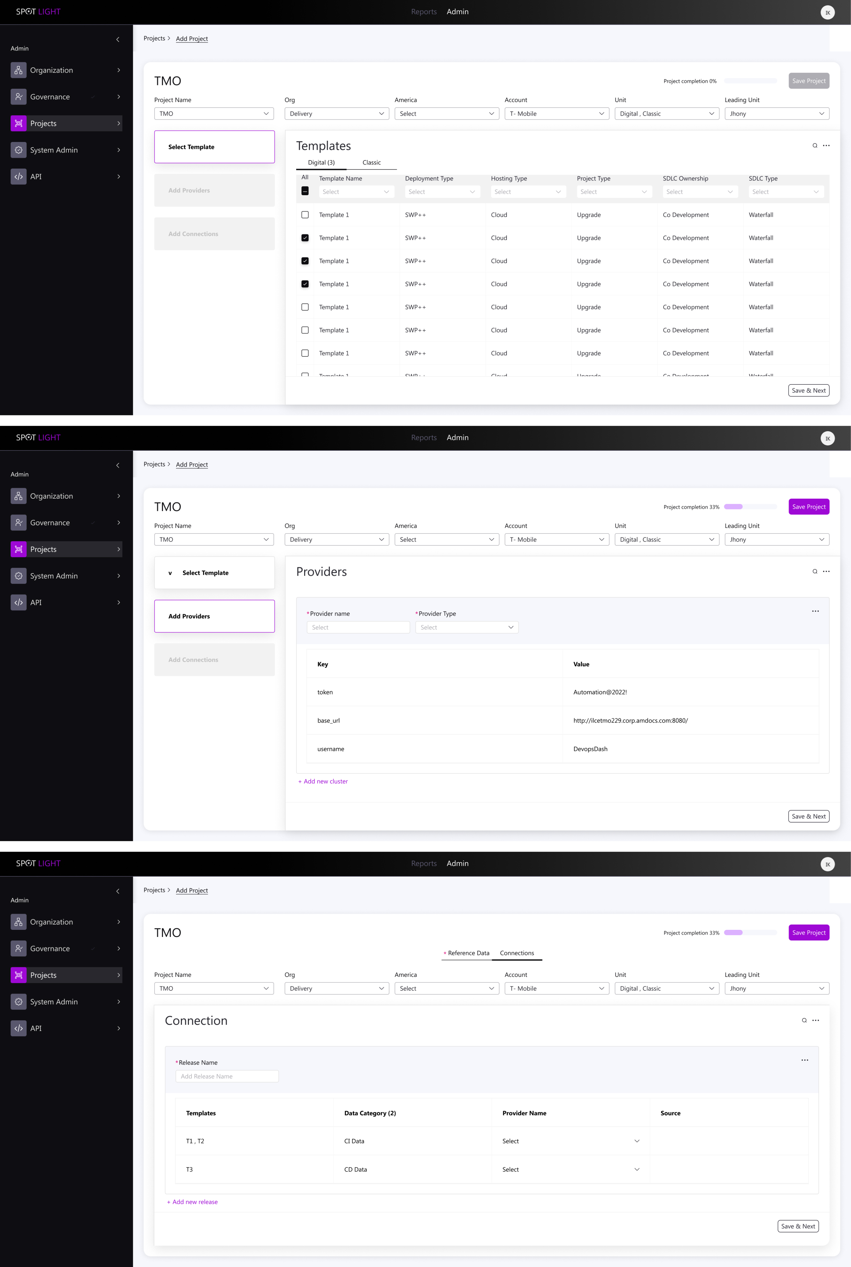
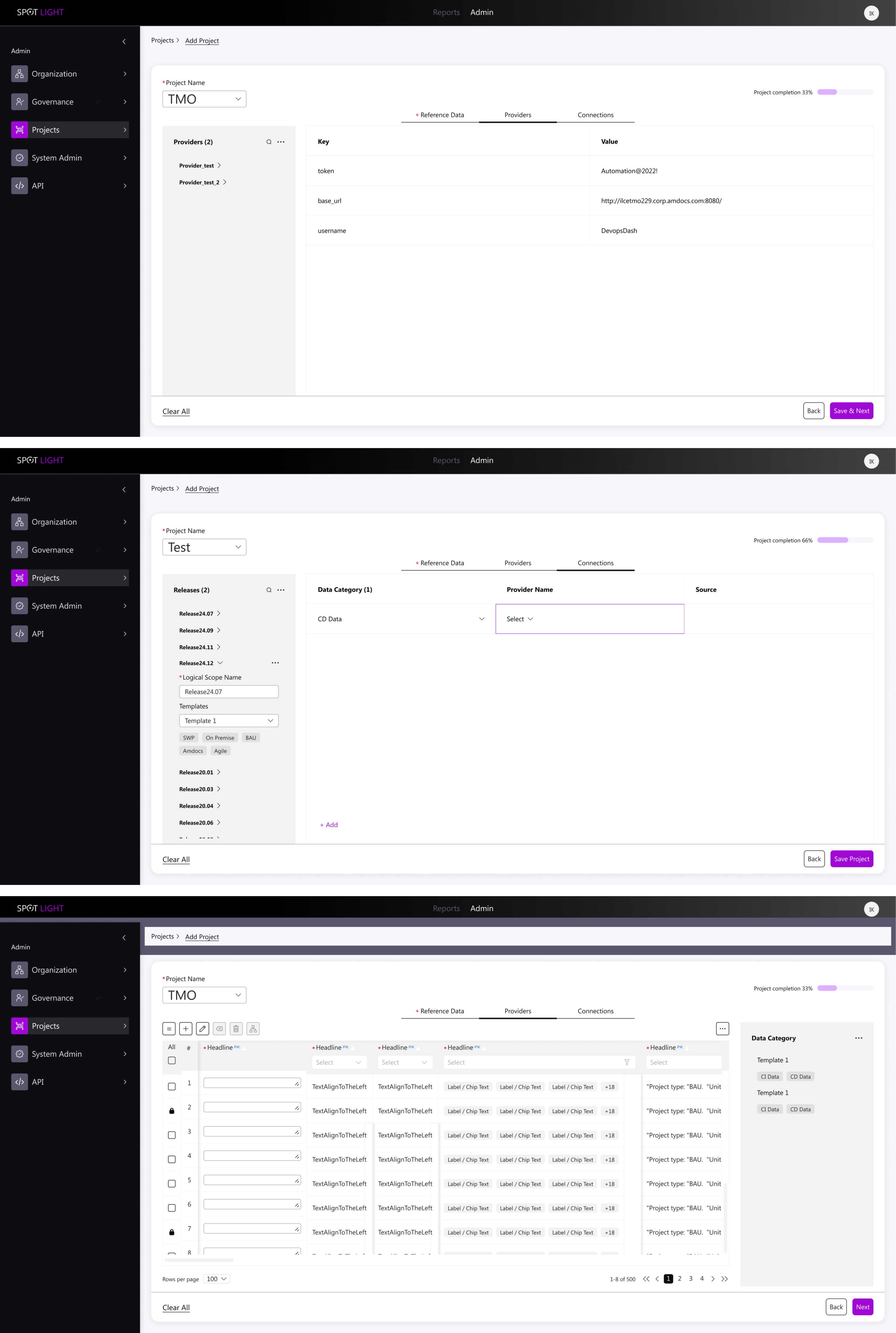
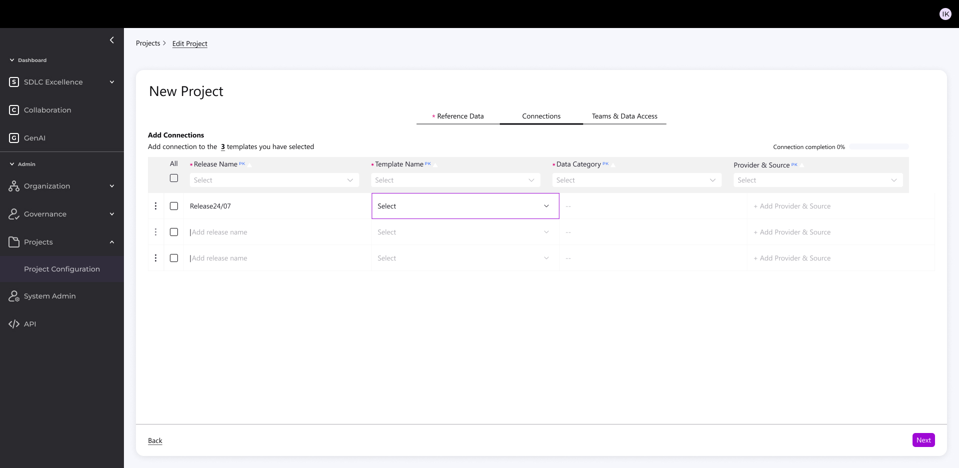
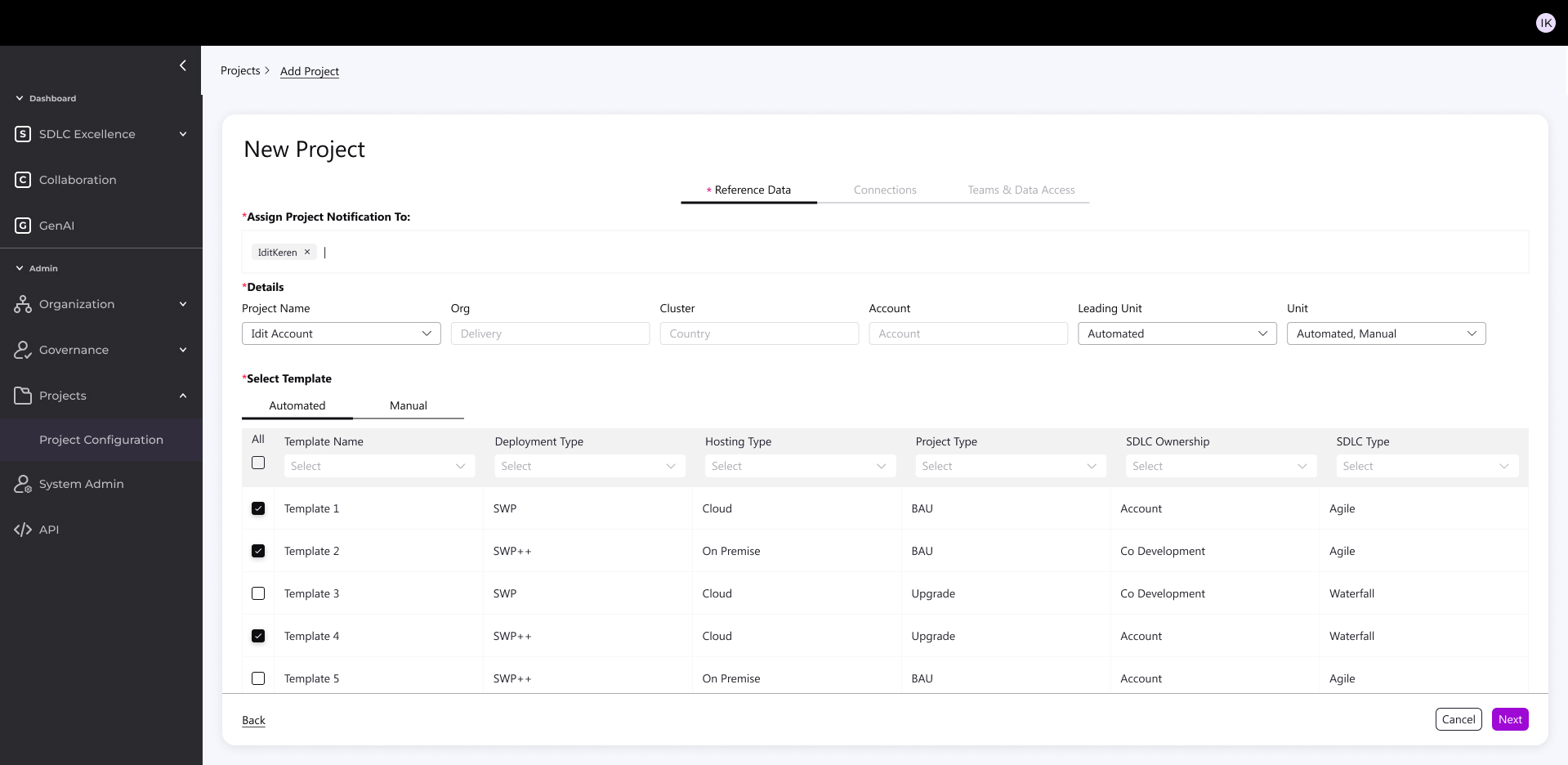
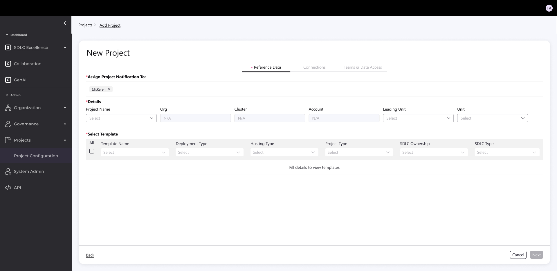
Feature Highlight: New Project Creation
Built simple admin KPI source connector for accounts/projects from CI/CD platforms
The Challenge:
- Creating a new project used to be:
- Complex and highly technical
- Time-consuming (connections, filtering, configuration)
- Difficult to scale across diverse environments (Cloud, Legacy, Agile, Hybrid)
The Solution:
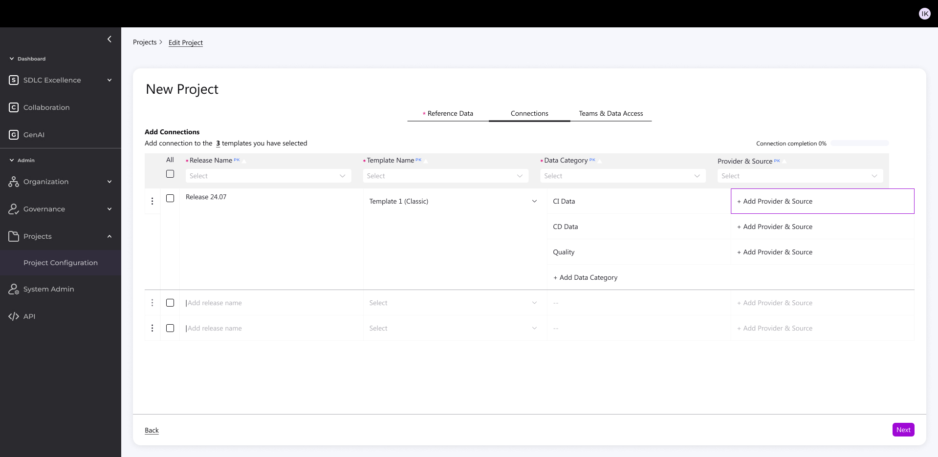
- I designed a 3-step, intuitive process accessible to both technical and non-technical users:
1. Parameters & Template
Enter key account settings (tech, methodology, etc.)
System suggests the right template
Supports mixed environments (Legacy + Digital)
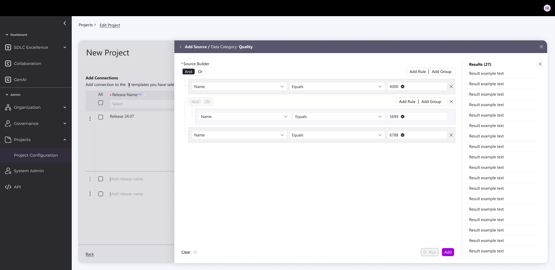
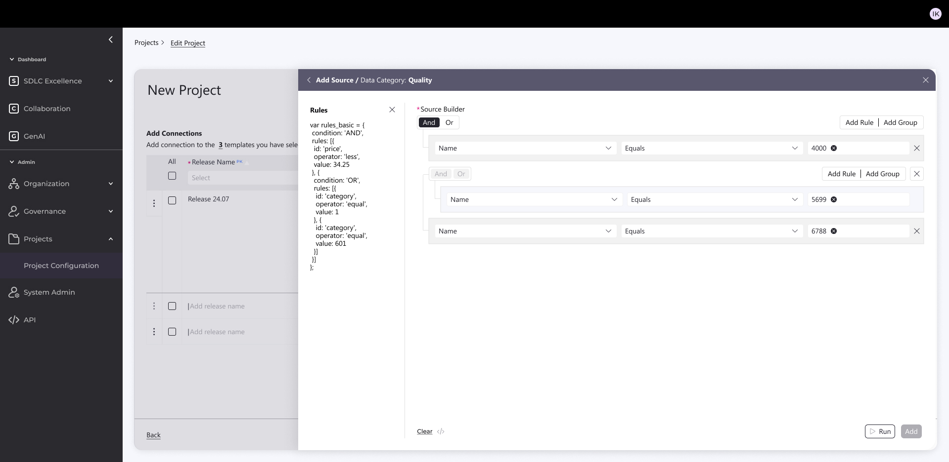
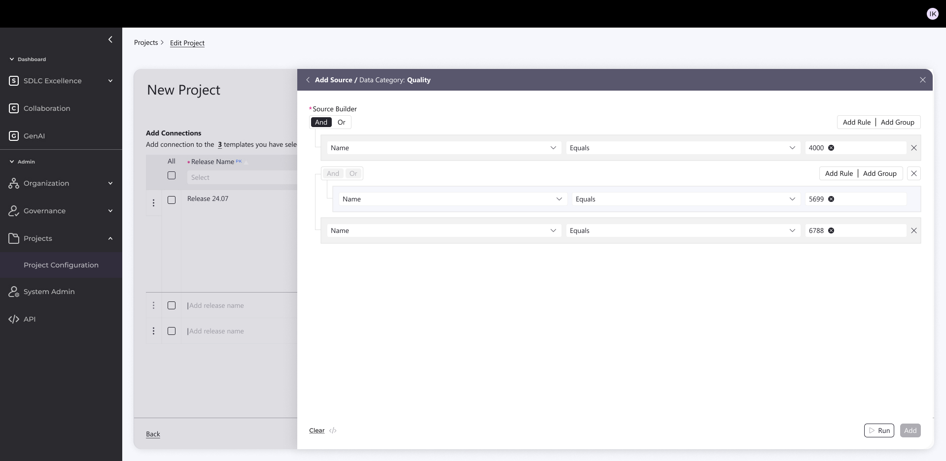
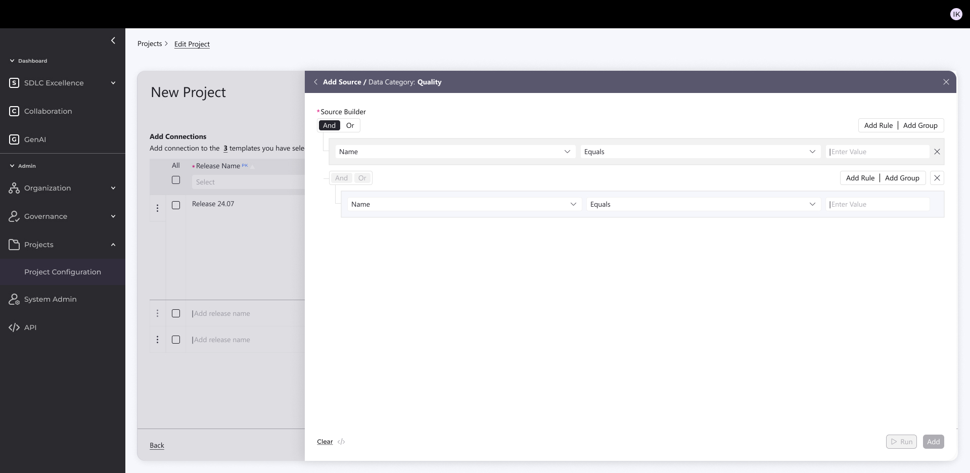
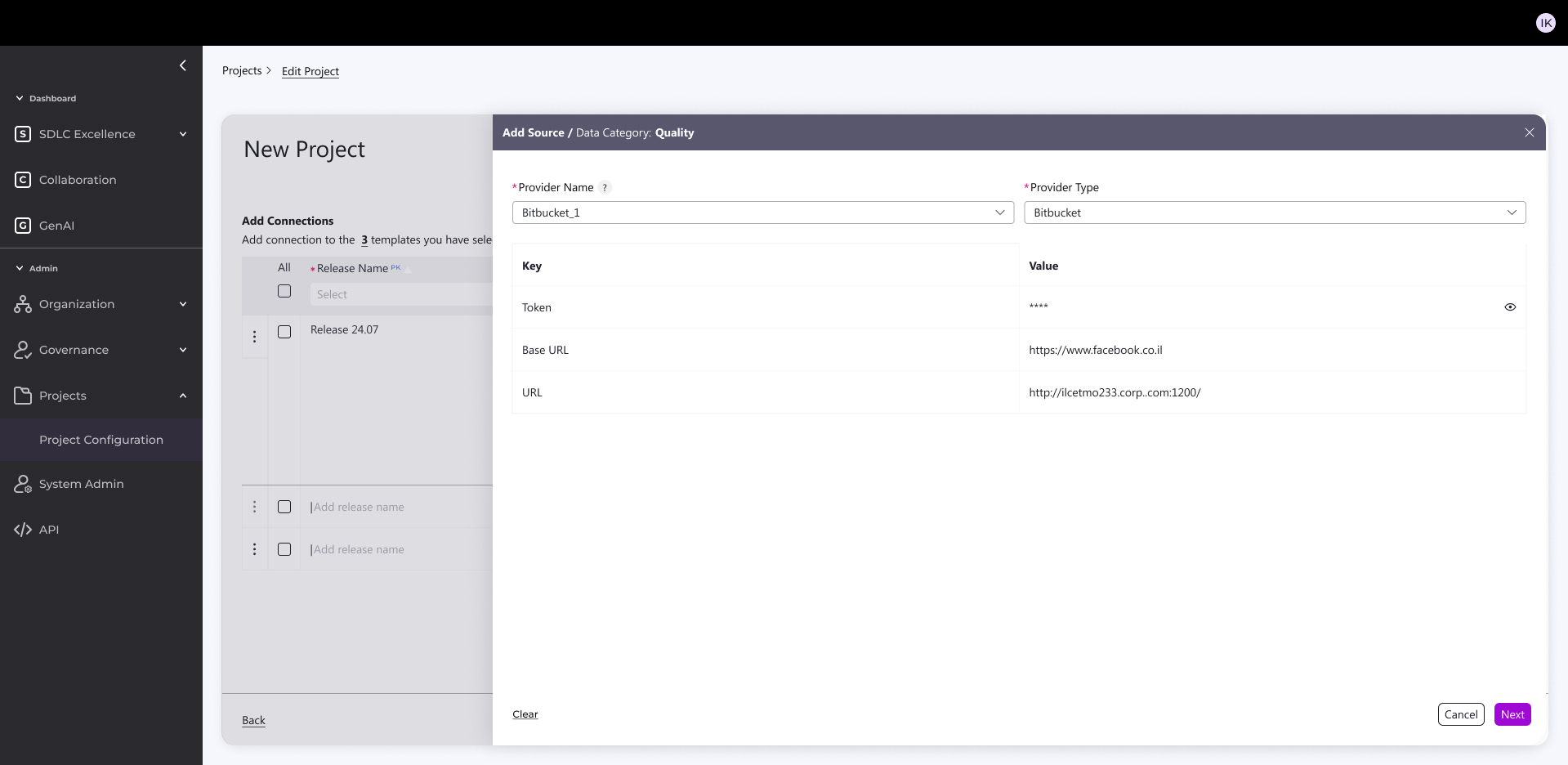
2. Data Connection & Configuration
Auto-connect to sources (Jenkins, Jira, GitHub, etc.)
Smart filtering → creates a “mini database” for efficient KPIs
Targeted queries down to product level with exclusions
Reuses existing connections to speed setup
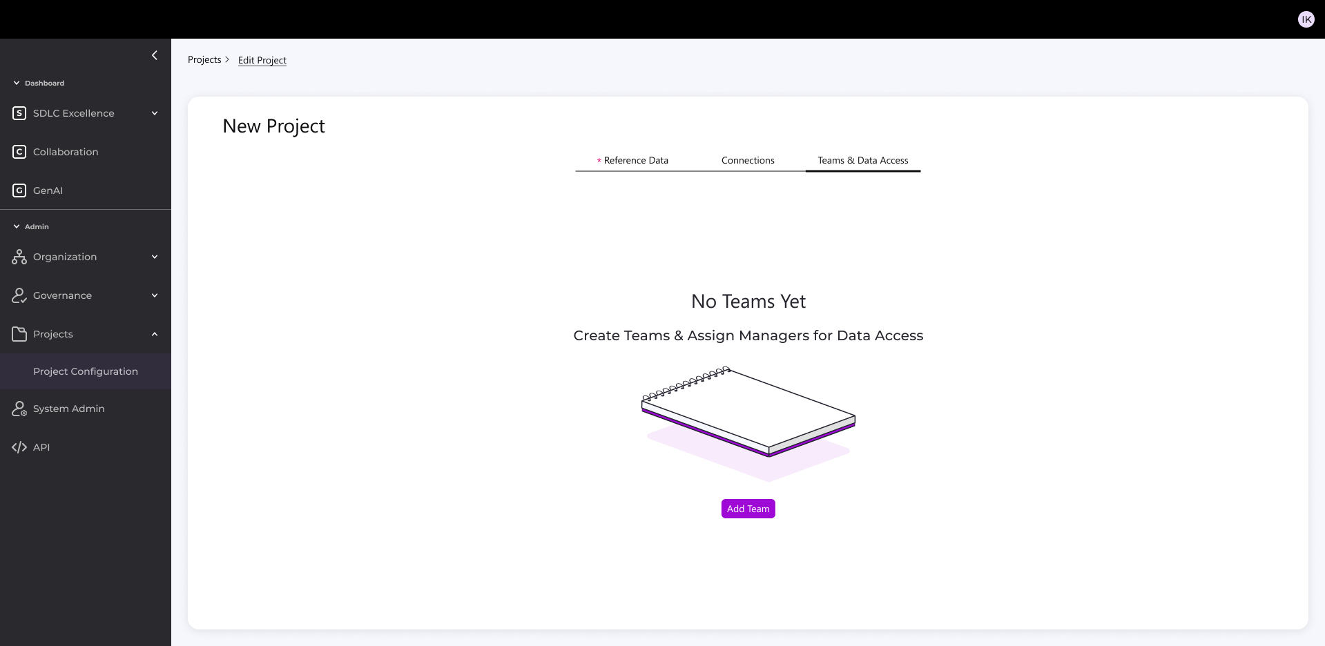
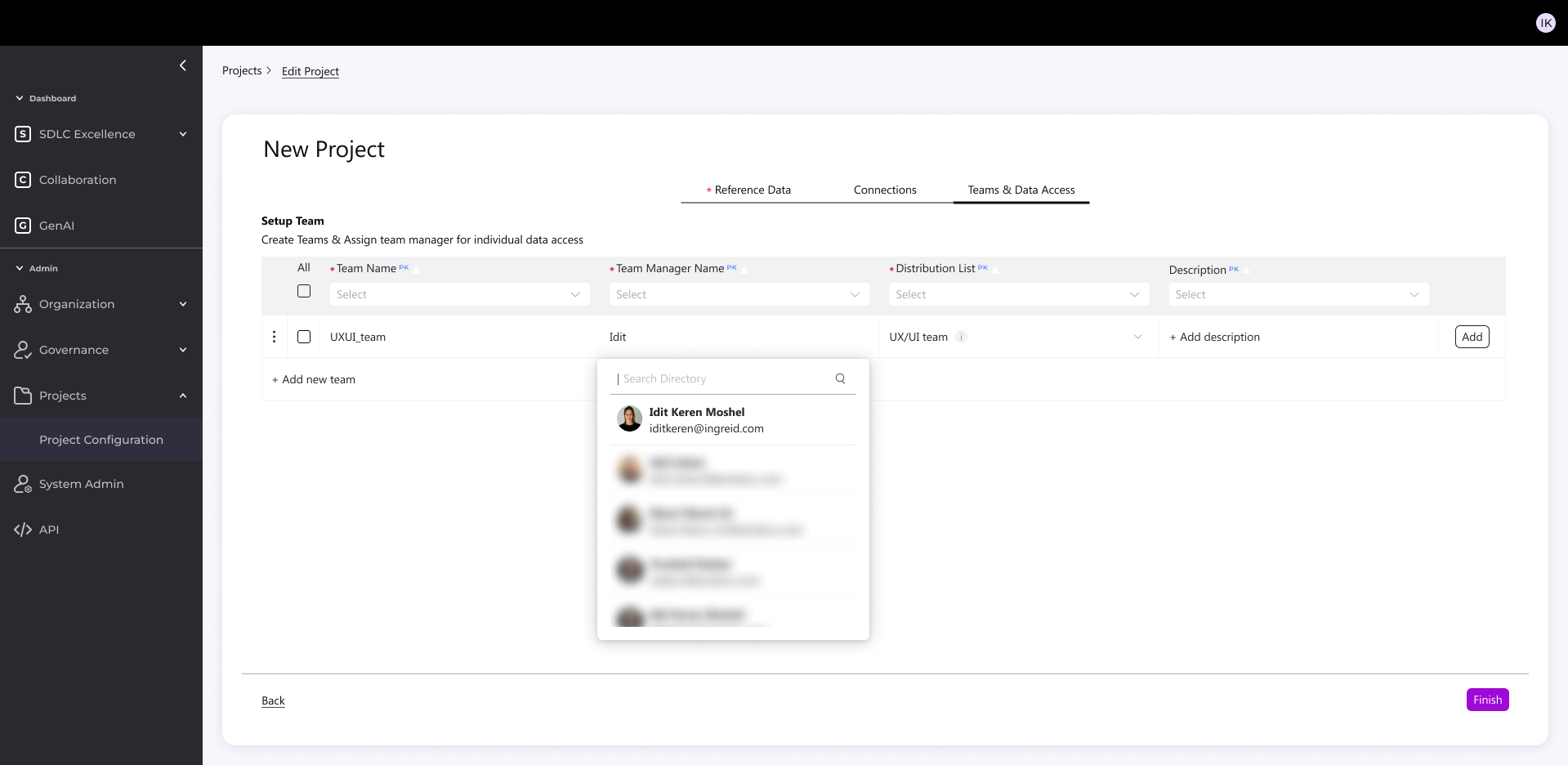
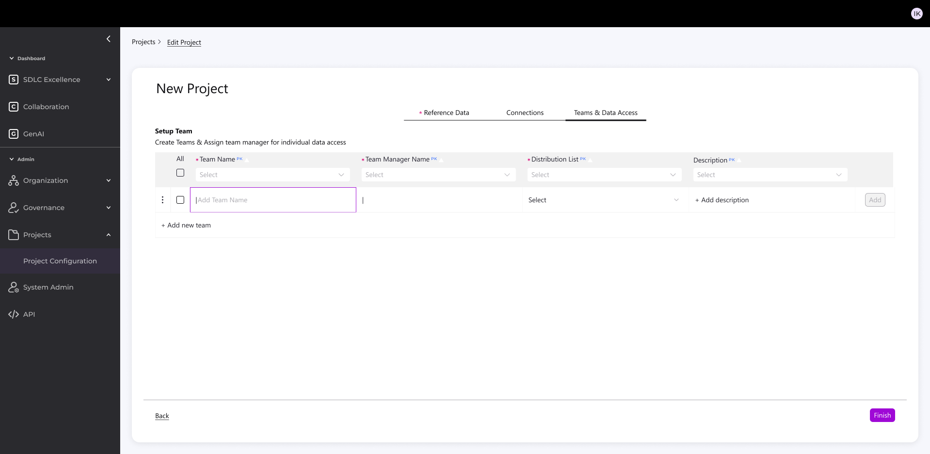
3. Team & Notifications
Auto-link to distribution lists
Targeted project notifications

Outcome
- 1 hour setup (even with complex validations)
- Easy version cloning with validations
- Balanced standardization + flexibility
- Reduced technical overhead
- More accessible, intuitive process for all users